
Stop Chasing Ghosts: How Five-Number Summaries Reveal Real Anomalies
Boo. No séance required.

Imagine this scenario: Your CISO wants you to investigate thousands of endpoint events for a potential threat. The data floods in, but it’s just noise. Spikes here, dips there, nothing concrete. Searches for known indicators turn up nothing. You’re chasing ghosts 👻. Now what?
This is where a simple but powerful statistical tool – the five-number summary – comes in. Instead of relying on averages that can be easily skewed by outliers or waiting for known indicators that may miss emerging threats, the five-number summary gives you a clearer view of your data. It highlights true outliers so you can focus on what matters. In threat hunting, this technique can be the difference between catching an attack early and spending the entire day chasing false-positive rabbit holes.
🚨 WARNING 🚨 THIS POST INVOLVES MATH (not that M-ATH). IF THAT MAKES YOU CRINGE - girl, SAME. BUT I PROMISE IT WILL BE EASY TO UNDERSTAND AND YOU WILL BE A BETTER HUNTER AFTER UNDERSTANDING THIS CONCEPT. /end rant

Why Five-Number Summaries Matter
Ever notice how a single outlier can completely skew an average? Or how "normal" behavior in your environment varies wildly throughout the day (especially if you are a global company)? This is why seasoned threat hunters don't rely only on averages.
🥁Enter the five-number summary. Rather than selecting a single "best" statistic, it provides five key data points, offering a more comprehensive view of what's going on.
The Five-Number Summary ✋: Your New Hunting Tool
The five-number-summary is a fundamental statistical concept that includes:
Minimum (smallest observation)
Lower quartile or first quartile (Q1)
Median (the middle value)
Upper quartile or third quartile (Q3)
Maximum (largest observation)
Why these five numbers over other statistics? These values provide a complete snapshot of the dataset: minimum and maximum show extremes, quartiles break it into meaningful segments, and the median gives a true center point. Even better, this summary can be visualized using a box plot (aka cat and whisker plot. yes, really 🐈). More on that later, but just know it’s an easy way to spot outliers at a glance.
Basic Five-Number Query in Splunk
Let’s start by looking at New Process Creation events (or, simply put, process execution) in Windows Event Logs, specifically for notepad.exe. Yeah, you know that notes app people like to use? This is a very simple way to look at activity, feel free to swap for another exe. Remember - Since this is statistics, we will have to focus on numerical values. For the example below, we are using the count of events.
index=thrunt sourcetype=XmlWinEventLog EventCode=4688 Process_Name=notepad.exe
| bucket _time span=1h
| stats count as executions by _time
| stats
    min(executions) as "Minimum",
    perc25(executions) as "First Quartile (Q1)",
    median(executions) as "Median",
    perc75(executions) as "Third Quartile (Q3)",
    max(executions) as "Maximum"
What does this query do?
Collects process execution events
Groups them into 1 hour buckets (bins)
Counts executions per process
Calculates our five-number summary
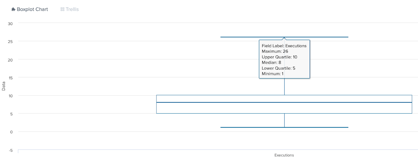
Example output:
Minimum: 0         (quietest hour - no one ran notepad)
Q1: 2              (in quiet hours, people ran notepad 2 or fewer times)
Median: 5          (typical hour - notepad was run 5 times)
Q3: 8              (busy hours had up to 8 runs)
Maximum: 20        (busiest hour - notepad was run 20 times)
What does this tell us?
If it runs 0 times, that’s unusually quiet. If it runs more than 8 times, that’s unusually busy. If it runs more than 20 times, that’s questionable and worth investigating.
The Power of IQR for Outlier Detection 💪
The five-number summary includes two statistical values named quartiles. Quartiles are three values that split your dataset into quarters.

Now that we understand quartiles, let’s take it a step further and discuss Interquartile Range (IQR). IQR is simply quartile 3 (Q3) minus quartile 1 (Q1). This is significant because it represents the range where the middle 50% of your data falls. tldr think of IQR as detecting the “normal” activity range. Seems like this could be interesting to help find outliers right? YES!
Let’s take our notepad example:
Q1 (First Quartile): 2 runs per hour
Q3 (Third Quartile): 8 runs per hour
IQR = Q3 - Q1 = 8 - 2 = 6
Let’s use the IQR to calculate the outliers:
Lower Fence = Q1 - (1.5 × IQR)
Upper Fence = Q3 + (1.5 × IQR)
IQR = 6
Lower Fence = 2 - (1.5 × 6) = 2 - 9 = -7
Upper Fence = 8 + (1.5 × 6) = 8 + 9 = 17
This tells us that any value below -7 (can’t have negative execution so not technically possible) and above 17 would be an outlier. Remember that maximum of 20? Definitely an outlier.
Let’s look at this in Splunk:
index=thrunt sourcetype=XmlWinEventLog EventCode=4688 Process_Name=notepad.exe
| bucket _time span=1h
| stats count as executions by _time
| stats
    perc25(executions) as Q1,
    perc75(executions) as Q3
| eval
    IQR = Q3 - Q1,
    lower_fence = Q1 - (1.5 * IQR),
    upper_fence = Q3 + (1.5 * IQR)
Remember to think of IQR as detecting your “normal” range of activity.
Values inside the fences = normal, values outside the fences = potential anomalies worth investigating
Why is this useful?
IQR helps you quickly spot unusual activity by defining what’s “normal” in your environment, even if the data is skewed or bursty. Because it focuses on the middle 50% values, true anomalies stand out more clearly. This simple yet adaptable approach cuts through the noise and pinpoints real threats more reliably than methods that can be thrown off by extreme outliers.
Enter the Box Plot (also called a box and whisker plot 🐈)
A box plot visualizes your five-number summary, giving you an instant visual sense of what "normal" looks like in your dataset. By highlighting the range of typical values (the interquartile range) and flagging anything beyond, it makes outliers EVEN MORE OBVIOUS and quickly reveals skews in the data.
What are we looking at?
Think of a box plot as your five-number summary come to life. Box plots instantly highlight outliers and shifts in behavior. If you suddenly see more executions outside the whiskers, it’s a 🚩!
Outliers           *     *
Maximum (Whisker) ┬─────
                  │
Q3 (Box Top)      ├─────┐
Median            ├─────┤  ← The "Box" shows middle 50% of data
Q1 (Box Bottom)   ├─────┘
                  │
Minimum (Whisker) ┴─────
Outliers           *
The box you see represents your IQR or middle 50% of executions
The line in the middle of the box is the median
The “whiskers” extend to your minimum and maximum (within 1.5 x IQR)
Anything beyond the whiskers are outliers!
What does it look like in Splunk? Let’s run the query to generate the five-number summary and visualize it as a box plot.
🚨 Important:
If you’re using the Splunk Machine Learning Toolkit (MLTK) app, you can simplify this by using the built-in boxplot macro. This macro automatically computes and formats the five-number summary needed for a box plot. However, it’s only available within the MLTK environment.
index=thrunt sourcetype=XmlWinEventLog EventCode=4688 Process_Name=notepad.exe
| bucket _time span=1h
| stats count as executions by _time
| untable _x field_name value
| stats min exactperc25 median exactperc75 max by field_name
| untable field_name calculations value
| xyseries calculations field_name value
| eval calculations = rtrim(calculations, "(value)")
Here, the box plot will let you instantly see when notepad.exe executions spike outside the normal “box,” signaling a possible anomaly.
WUT?!? 😵💫
That was a lot. Let’s walk through that query step by step.
Breakdown of the Query
Data Selection & Bucketing:
index=thrunt sourcetype=XmlWinEventLog EventCode=4688 Process_Name=notepad.exe
| bucket _time span=1h
| stats count as executions by _time
Pulls notepad.exe execution events from Splunk.
Buckets them into 1-hour intervals (bucket _time span=1h).
Counts executions per hour (stats count AS executions).
Transforming Data for the Box Plot Macro:
| untable _x field_name value This transforms the column-based result into row-based format. (Did you know? Splunk’s stats command produces wide results (columns), but some visualizations—like box plots—work better with long format data (rows).)
_x is just a placeholder column name
field_name will hold the original column names (executions)
value contains the actual data
Calculating the Five-Number Summary:
| stats min exactperc25 median exactperc75 max by field_name 6. Computes the five-number summary:
min (minimum)
exactperc25 (Lower quartile or first quartile (Q1))
median (middle value)
exactperc75 (Upper quartile or third quartile (Q3))
max (maximum)
Reshaping the Data:
| untable field_name calculations value | xyseries calculations field_name value7. This flattens the structured five-number summary (min, exactperc25, etc.) into a specific format for xyseries:
field_name holds the original column names (min, median, etc.).
calculations holds the statistical values.
8. xyseries ensures data is structured correctly for Splunk’s box plot visualization.
Cleaning Up the Labels:
| eval calculations = rtrim(calculations, "(value)")9. Removes unnecessary labels ((value)) for cleaner visualization.
Note on the `boxplot` macro:
The final data structure (five rows for min, Q1, median, Q3, and max) is exactly what Splunk’s box plot visualization expects. This query effectively acts as a boxplot macro, transforming raw execution data into a ready-to-visualize format.
Making Box Plots Work for Threat Hunting
Compare processes against themselves over time
Spot seasonal patterns (business hours vs. off-hours)
Compare similar processes against each other
Identify processes with unusually variable behavior
🏁
✅ MATH ✅
Look at you, surviving math like a pro. 😅 Now go hunt some threats!
Key Takeaways
Math is cool (and you just became a better thrunter because of it).
Averages lie. A single outlier can skew your entire analysis, use the five-number summary to give you a complete picture of your data.
IQR is your friend. It shows where your “normal” activity is and adjusts to your environment’s scale.
Box plots turn complex stats into easy to interpret visuals.
Call to Action
Try these queries in your environment and see what you can uncover!
Share your findings with the community. I want to see some box plots 📦
What should we cover next? Standard deviation? Mean vs. median? Drop a comment!
Let’s make stats work for us, not against us. 🚀
Happy thrunting!