
The Shape of Time: Mastering timechart
SPL Dispatch #3 - 10/07/2025

Welcome back to SPL Dispatch, our series highlighting one Splunk command at a time, explaining why it matters for threat hunting and how to use it effectively. This round we’re talking about one of the most useful and underappreciated visualization tools in Splunk: timechart.
If tstats gives you speed and eventstats gives you context, timechart gives you shape. It turns counts into a timeline you can actually see. Because sometimes the hunt isn’t about a single weird event, it’s about when that weirdness happens.
Why timechart?
Ever looked at a dataset and thought, “Cool numbers, but when did things actually go sideways?” That’s exactly where timechart shines. It converts raw event counts or field values into a timeline, letting you spot patterns, bursts, and quiet gaps that would otherwise stay hidden. It’s perfect for detecting beaconing intervals, bursts of logons, steady exfiltration, or behavior that follows a clockwork rhythm.
How it works
timechart is just stats with _time baked in. You group by a time span and optionally a field to summarize activity over time.
index=thrunt sourcetype=auth

| timechart span=5m count BY user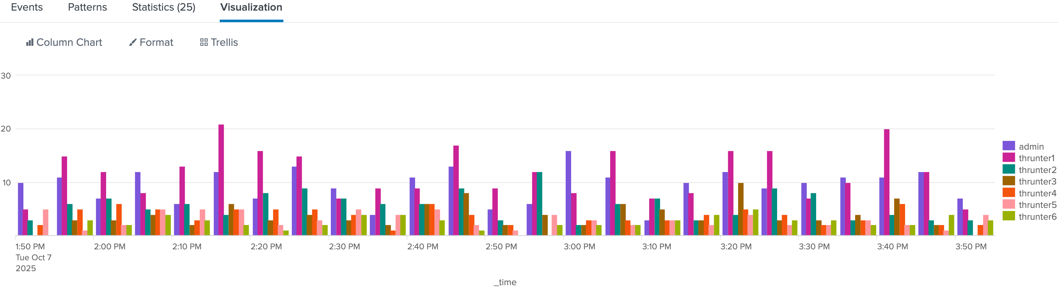
This query counts authentication events per user every five minutes. If a single account suddenly spikes in frequency or goes quiet, you’ll see it instantly. You can switch to a line or area chart in Splunk’s visualization panel to see trends more clearly.
When to reach for timechart
Use timechart when your question starts with “when.” You’ll reach for it when you’re baselining normal behavior per host or user, spotting periodic activity that hints at automation, or comparing multiple event types along the same timeline. It’s also great for validating detections that depend on timing or volume changes.
Let’s say you’re seeing rsync in your Linux audit logs and want to understand how often it runs.
Step 1: What happened?
index=thrunt process_name=rsync

| stats count
Cool. It ran 73 times today. But when?
Step 2: Add a sense of time
index=thrunt process_name=rsync

| stats count by date_hour
Better. You can now see hourly activity.
Step 3: Reveal the rhythm
index=thrunt process_name=rsync

| timechart span=15m count
Boom. There it is. Perfect six-hour intervals, every time. Probably not a human at the keyboard.
Step 4: Confirm the schedule
index=thrunt sourcetype=linux:audit process_name=rsync

| eval hour=strftime(_time,"%H"), minute=strftime(_time,"%M")

| stats count by hour minute

| where count > 5
This shows exactly when rsync fires most often. Your cron job smoking gun. That level of regularity can reveal persistence or automation that blends in during normal event-by-event review.
Example Hunt Queries
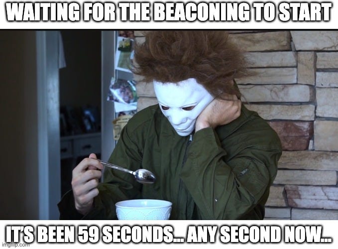
Scheduled suspicion
index=thrunt sourcetype=linux:audit

process_name=rsync OR process_name=scp

| timechart span=15m count BY process_name
Once you’ve confirmed that rhythm, stack it against other processes to see what else moves to the same beat.
This buckets process executions into 15-minute windows. If you see precise, consistent intervals, you’re likely looking at a scheduled task or persistence mechanism rather than a human operator.
What makes this suspicious:
Rsync spikes at perfect intervals (12:00, 12:15, 2:00—too precise).
Humans don’t run backups like clockwork.
The scp activity (pink) looks more organic. Random times, varying volumes.
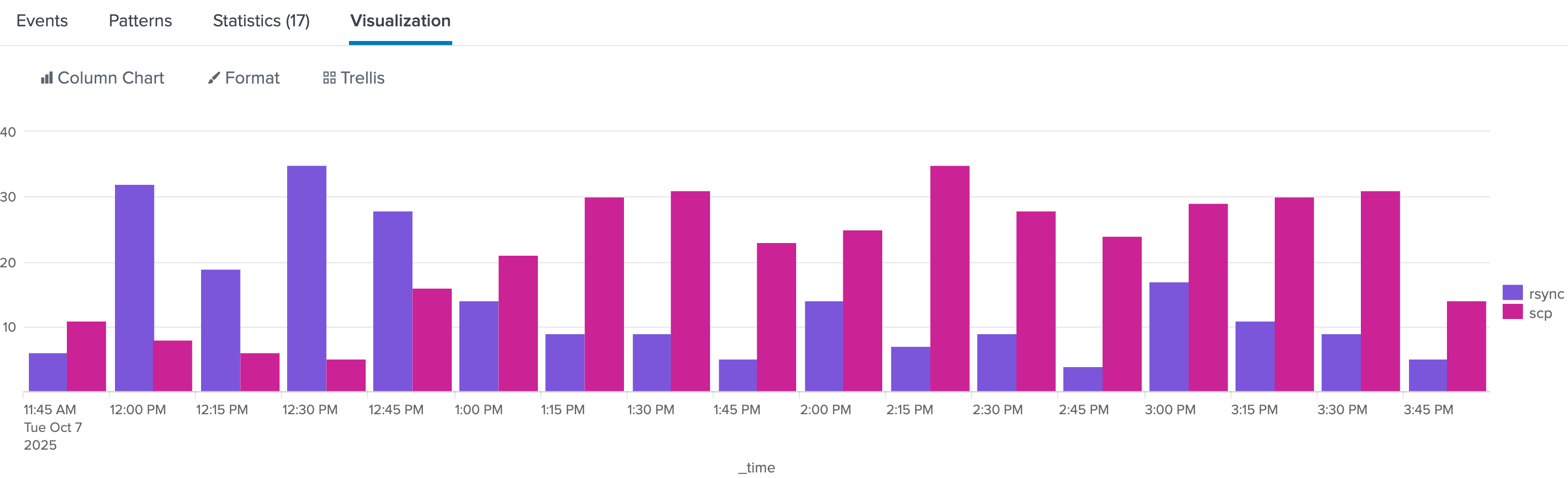
DNS beaconing revisited
That same pattern logic applies beyond processes: beaconing, DNS lookups, even data exfiltration have their own timing signatures. For example:
index=thrunt sourcetype=stream:dns

| timechart span=1m count BY src_ip
Plot it and look for perfectly even spikes or uniform counts over long periods. Humans don’t behave that predictably. Systems typically do.
See anything interesting?
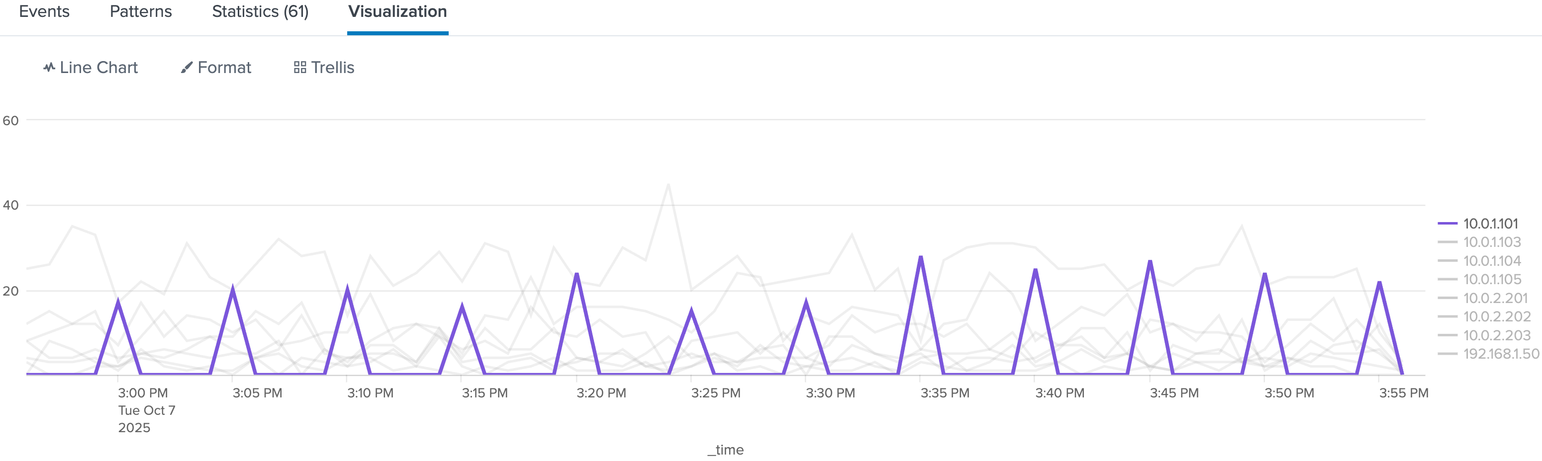
Might be worth digging into.
Pro tips
Choose your span carefully. Too large and you’ll flatten the pattern; too small and you’ll create noise. Match it to your data volume and hunt objective. Use functions like avg(bytes), sum(duration), or p95(response_time) to enrich your analysis beyond simple counts. Combine timechart with eventstats or streamstats to layer context, calculate moving averages, or identify deviations over time.

Final thought
Threat hunting is about finding stories hidden in your data. timechart gives you the timeline to tell them. It turns chaotic logs into visible narratives of peaks, valleys, and repeating patterns that hint at persistence, automation, or compromise.
Useful Resources
Happy thrunting!

Sydney, this is a great post thank you, I wonder if you have ever tried to correlate 2 searches together to show overlapping data? For instance we had some DNS traffic trigger an alert on our firewall and tracked it down to some users logged in remotely (not from our firewall logs). I was able to see visually the 2 events but that was only after manually eliminating the events that didn't overlap:
This was the gist of my search:
index="firewall" {interesting.DNS.Query}
| timechart span=5m count AS Suspect_DNS
| appendcols [
search index="remote_access" NOT ({Long list of users I filtered out})
| timechart span=5m count by user
]
https://substack.com/profile/472408239-brian-e-kirk/note/c-221945706?utm_source=substack&utm_content=first-note-modal